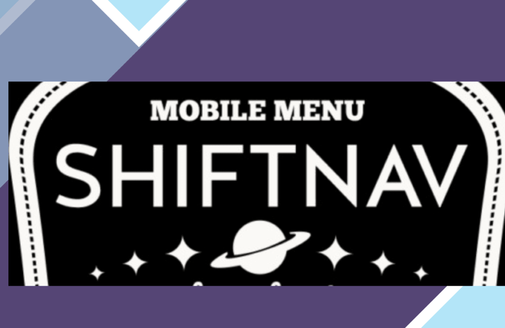
Elevate your WordPress website’s navigation with ShiftNav, the ultimate solution for creating a sleek and user-friendly mobile menu. Designed to mimic the familiar and intuitive off-canvas slide-out menus seen in popular apps such as Facebook and Gmail, ShiftNav offers a seamless browsing experience for your visitors.
With ShiftNav, you can customize every aspect of your mobile menu to match your website’s branding and style. Choose from a variety of navigation styles, icons, colors, and animations to create a menu that not only looks great but also enhances user engagement.
Whether you’re running a personal blog, an online store, or a corporate website, ShiftNav is the perfect addition to improve your site’s navigation on mobile devices. Say goodbye to clunky and outdated menus, and say hello to a modern and dynamic mobile menu that will impress your visitors.
Don’t let poor navigation hinder your website’s success. Upgrade to ShiftNav today and take your mobile user experience to the next level!
